Here by The Economist. Back in 2007 Davi Zell and I tried to make a similar map. But I must admit that the Economist one is much better. (The original idea, as far as I know, comes from strange maps.)
Showing posts with label Maps. Show all posts
Showing posts with label Maps. Show all posts
Monday, September 5, 2011
Tuesday, November 9, 2010
MapCrunch, the most addictive site. Ever.
Here. Select "Slideshow", choose a couple of countries and enjoy. (Via BoingBoing).
Wednesday, October 6, 2010
Wednesday, June 2, 2010
Thursday, May 6, 2010
Maps! Maps! Maps!
The Beauty of Maps:the dark side of the moon, XVI century Constantinopla, the Universe and beyond... (HT do Breno Baldrati)
Maps: Power, Plunder and Possession:
BBC docs are blocked outside the UK, so you have to find another way to download them.
Maps: Power, Plunder and Possession:
BBC docs are blocked outside the UK, so you have to find another way to download them.
Tuesday, May 4, 2010
Reboot of the European airspace
after the eruption of the I-dunno-how-to-spell-it volcano:
HT Caio Cardim.
Tuesday, December 15, 2009
Malaria in 1870 USA
Darker shades represent places with a higher share of malaria victims among the dead. It could reach almost 18% in some counties.
Wednesday, September 23, 2009
Saturday, September 5, 2009
Wednesday, September 2, 2009
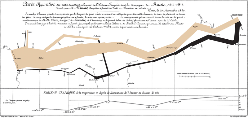
Napoleon in Russia
Drawn by Charles Minard (1869), the thickness of the lines indicates the size of Napoleon's army on his way to Moscow (1812-1813). Quite macabre, but it is a beautiful graph anyway.
Monday, May 25, 2009
Google Maps + Time Machine
Be prepared to spend more than 8 hours just in Hypercities.
(Zephyr Frank and Sidney Chalhoub were (are?) working on something similar for Rio de Janeiro)
Via Wired.
(Zephyr Frank and Sidney Chalhoub were (are?) working on something similar for Rio de Janeiro)
Via Wired.
Thursday, May 21, 2009
Jorge Luís Borges reads "Del rigor en la ciencia" (On Exactitude in Science) (Via Boing Boing)
In that Empire, the Art of Cartography attained such Perfection that the map of a single Province occupied the entirety of a City, and the map of the Empire, the entirety of a Province. In time, those Unconscionable Maps no longer satisfied, and the Cartographers Guilds struck a Map of the Empire whose size was that of the Empire, and which coincided point for point with it. The following Generations, who were not so fond of the Study of Cartography as their Forebears had been, saw that that vast Map was Useless, and not without some Pitilessness was it, that they delivered it up to the Inclemencies of Sun and Winters. In the Deserts of the West, still today, there are Tattered Ruins of that Map, inhabited by Animals and Beggars; in all the Land there is no other Relic of the Disciplines of Geography.Borges' short stories give lessons in Methodology . "El rigor..." is a perfect response when somebody criticizes a model for being an abstraction of reality. "Funes, the Memorious" explains why it is dangerous to consider all details of reality or history. Abstraction is a necessity.
Saturday, April 25, 2009
The Map of the Plague
Aqui. Hat tip Rafael P.
What happened in Milan? Google says that there "city officials immediately walled up houses found to have the plague, isolating the healthy in them along with the sick". Ouch.
Thursday, October 18, 2007
Why do we like beer?
Because the guys that couldn't stand alcohol died of dysentery a long ago. This is just one of the things that I've learned in "The Ghost Map: The Story of London's Most Terrifying Epidemic--and How It Changed Science, Cities, and the Modern World". The logic goes like this: polluted water is a major threat to human beings, so...
BTW, I strongly recommend the book. It provides an amazing account of the role of scientific preconceptions, and it tells the story of the map that started Spatial Analysis. Spoiler: it is a myth that John Snow discovered the source of cholera after drawing his famous map. In fact, he draw it to convince the others that water, and not, miasma was responsible for the spreading of the disease.
"In a community lacking pure-water supplies, the closest thing to "pure" fluid" was alcohol. Whatever the risks were posed by beer (and later wine) in the early days of agrarian settlements were more than offset by alcohol's antibacterial properties. Dying of cirrhosis of the liver in your forties was better than dying of dysentery in your twenties... To digest large quantities of (alcohol), you need to be able to boost production of enzymes called alcohol dehydrogenases, a trait regulated by a set of genes on chromosome four in human DNA. Many early agrarians lacked that trait, and thus were genetically incapable of "holding their liquor". Consequently, many of them died childless at an early age, either from alcohol abuse or from waterborne diseases... Most of the world's population is made up of descendants of those early beer drinkers, and we have largely inherited their genetic tolerance to alcohol."
BTW, I strongly recommend the book. It provides an amazing account of the role of scientific preconceptions, and it tells the story of the map that started Spatial Analysis. Spoiler: it is a myth that John Snow discovered the source of cholera after drawing his famous map. In fact, he draw it to convince the others that water, and not, miasma was responsible for the spreading of the disease.
Friday, June 15, 2007
US states renamed for countries with similar life expectancies

Davi Zell and I had a few problems with this one. The differences in life expectancies at birth among US states were quite small and we had to repeat countries and even include the USA in the map.
This is really addictive, but this is the last (strange)map spin off that I will ever do. (Ok, maybe just one more :-)).
Brazilian States Renamed for Life Expectancy

(Click to enlarge)
Bad news. The worst case is Maranhão (Bangladesh) and the best is Santa Catarina (Argentina). Actually, life expectancy in Brazil has improved since 2000, but - as the other countries have improved as well - he relative situation of the Brazilian states is far from acceptable. The map is a joint production Zell & Monasterio.
Monday, June 11, 2007

Subscribe to:
Posts (Atom)